Мерчандайзинг

Merchandising Rules

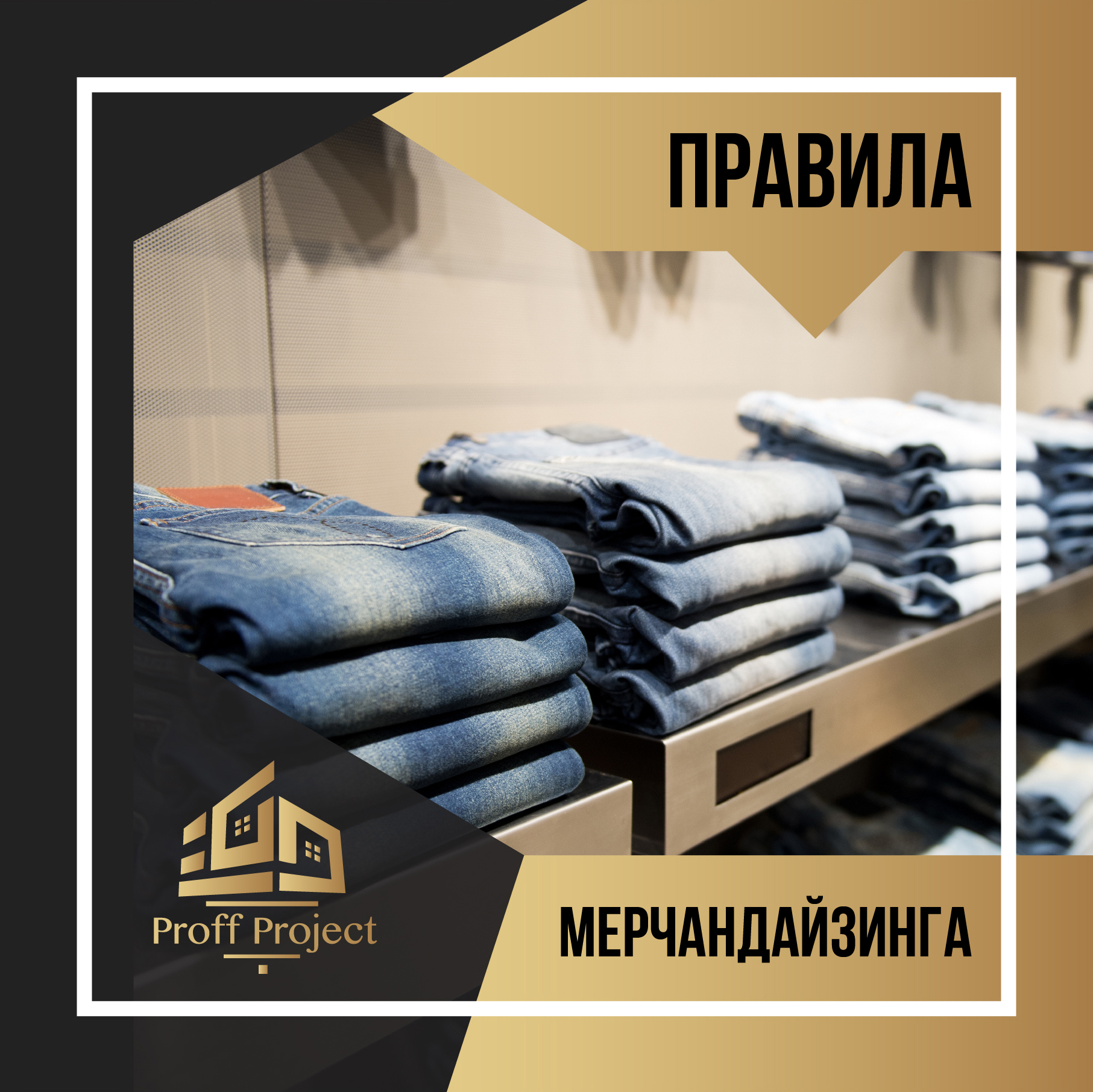
🛍 All known merchandising rules also work in clothing stores. The same product can be placed at different heights, and their sales will vary precisely from the height of the shelves. According to experts, the most effective shelf is at the level of hands, the shelf, which is located at eye level, is next in terms of purchasing activity. It is also known that a shelf at eye level attracts attention better, and a shelf at hand level - motivates to action. Only shoes can be placed at floor level. ⠀

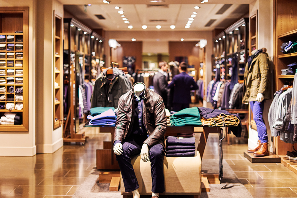
👤 To facilitate the selection and ⠀
in order to pay attention to the most interesting models of clothing, use mannequins - this is the most popular way to attract the attention of the buyer. In addition, mannequins perform another important function - they decorate shop windows and a trading floor. Often they are put in glass boxes, but with a competent arrangement they are installed in the trading floor. A correctly selected image on a mannequin will ensure that the client will try on and purchase the whole set at once. This is why the mannequins are convenient - they allow a potential buyer to evaluate how clothes look on the figure and how individual elements of the collection are combined. ⠀

❗ All new items not placed on mannequins should be placed frontally - this will immediately draw the buyer’s attention to them. ⠀

💸 Product selection is half the battle. The second half is the most important: payment and completion of the purchase process. Both of these shopping features should be comfortable and enjoyable. For this, it is important to ensure a convenient approach to the checkout and, if possible, eliminate the occurrence of queues. In addition, people paying for the purchase should not interfere with other visitors. After the payment for the goods has been made, he gets to the place for packaging, which is most often combined with the cash register. The process of completing the purchase should leave pleasant emotions. Take care of it! ⠀

🔶 And the company "Seven High-Rise" will take care of creating your store! ⠀⠀

Цвет в дизайне офиса

Color in office design

Color in the design of a modern office ⠀

It is incredibly important in such specific purpose rooms as offices. A person perceives each shade differently and involuntarily reacts to what he sees. Much has already been said about the psychology of color. There are spectra of irritating, exciting or relaxing effects, therefore, in order to increase staff performance and create a calm atmosphere that is not conducive to conflicts, you should choose the right color design for the office interior. Here a lot of subtleties and nuances appear. ⠀

📕 Pastel should become the background color in the design of the office. These tones are light and neutral. The introduction of colorful accents will help to avoid dullness in the setting. But you need to add brightness in a very metered way, so as not to overload the space and instead of concentration do not cause apathy and inattention in people. ⠀

📘 The second aspect that is certainly worth attention is the location of windows in the layout of the office space. If they look north, then it will be nice to “warm” the room and compensate for the lack of solar lighting in the office, having designed it in grassy, purple, peach, cream and other warm colors. In the sunlit space opposite, representatives of the "cold" spectra will be popular. In favor are varieties of blue, especially azure and amethyst. ⠀

📗 The size of the office space will also influence the choice of the background solution. Small spaces will have to be visually expanded. The blue color and shades of light green will wonderfully cope with this task. In spacious rooms, the task is exactly the opposite. The interior design of the office must be filled with comfort, so you will have to work with terracotta paints and representatives of the brown palette. Shades of light greens will visually increase the space. Office design should be performed rhythmically, so you can use the method of increasing the color intensity of the background. Depth shades are added as the distance from the entrance. This subconsciously helps customers navigate in space and move in the right direction.

Планировка офиса

Office layout

We continue to talk about approaches to the planning of the office. ⠀

📎 European office option ⠀
This is the same open space, but with one difference. There is an abundance of isolated spaces organized according to the cabinet type. The layout of the office space provides for a variety of rooms in terms of functionality, including a meeting room, a relaxation room, and structural units. For the design of a modern European-style office, they choose the appropriate interior solutions in the spirit of hi-tech, minimalism, futurism. ⠀

🏮 Japanese version ⠀
The Japanese differ in their approach to design quite ⠀
radically. Their design approach is based entirely on hierarchical principles. However, such a specific vision of the interior does not prevent it from remaining highly functional. In this case, the area of the working space is directly proportional to the position occupied by the employee. The management link is located in the center of the hall. Its representatives always sit facing subordinates. For complete control of employees, the design of a modern office does not provide for any isolation of personal space using partitions. ⠀


🌺 Decor is not alien to the interior of such an office. A characteristic feature of the European-organized space is the engraving of doors and reception desks, as well as the presence of monofunctional and ergonomic furniture in the office. Contrasting solutions are not typical for minimalist interior design of the office, but the clarity of lines and shapes is in favor. ⠀

🏢 High-tech style in which there is a lot of glass and metal. The decor can be a wall painting in the form of parallel lines, combined with some details of the corporate identity. But minimalism, although it shies away from any decor, will allow you to experiment from the heart with the color scheme of the office ⠀

❓Tell about a few more options ⠀
office space layouts?

Офисное пространство

Office Space: Organization Options ⠀

Office Space: Organization Options ⠀

💡 Office is the think tank of your company. And how should everything be arranged in the brain? Right! Everything is in place and in order! After all, it is here that brilliant ideas and creative solutions arise! But in order for these processes to proceed easily, it is necessary to create optimal conditions through the organization of office space. To date, three options for their design are used: ⠀
- Open space (came to us from America) ⠀
- European style ⠀
- Japanese style ⠀

🗃 Open Space ⠀
American-style open offices appeared here not so long ago, but have already managed to gain many fans and are quite actively crowding out the usual planning system. The principle of its organization implies the presence of all employees, including management, in one spacious hall. No doors, interior walls or corridors. In the interior design of the office, mobile and transformable partitions are actively used. With their help, the personal space of each employee is allocated ⠀

🔲 Another interesting feature of open spaces is minimalism in furniture. Almost do not use decor (in the classical sense), only logos and company attributes of the company. The general style of the office is in corporate colors .⠀

🔲 The head’s office is not often designed differently, but they try to make it separate. When planning an office space, this part can be separated into a separate office or securely fenced off from the rest of the area, for example, hiding behind blinds. ⠀

🔗 With this approach to the organization of the office, optimal air conditioning and lighting is provided. And also people who are focused on solving certain problems can freely discuss working moments. ⠀

🗄 Employees are not always seated at separate tables. Sometimes their workplace becomes one table. This office furniture can have the most unpredictable configuration. Storage systems represent modules. Other furnishings are also lightweight and mobile. Examples of such interiors can be seen in banks. ⠀

▶ In the next posts we will talk about the European and Japanese planning system!

Зонирование офиса

Office zoning secrets

What zone is what the office is responsible for? ⠀

🗣⠀
Reception ⠀ ⠀
Presentation area of a company that talks about ⠀
corporate values of the company. It should cause purely positive emotions for all visitors. It is advisable not to use any partitions and racks - so the appearance of the reception is much more layout. The role of barriers can perfectly fulfill the overall plants in tubs and streamlined tables. Take care ⠀
about the comfort of visitors and create a cozy waiting area, furnishing it with comfortable upholstered furniture. ⠀
⠀⠀
👥 Conference room ⠀⠀
The meeting room should be spacious and roomy. The interior design here is elegant rigor. In the conference room, nothing should distract from the issues under discussion. The center of the interior composition will be a meeting table. This piece of furniture in the office should be of a respectable design and large. It is desirable that the design does not have corners. This will exclude the possibility of someone dominating their conversations, which is quite possible at a traditionally rectangular table. ⠀
⠀⠀
👤 Chief's office ⠀ ⠀
Since business etiquette allows the manager to receive VIPs not in the conference room, but in his own office, then in his planning it is necessary to provide a corner where there would be the opportunity to talk “on equal terms”. Accepting important customers while sitting at the desk, even if of a luxurious appearance, is bad manners. ⠀
⠀⠀
🔶 Want the correct zoning in the office? ⠀⠀

Дизайн офиса

Modern office design

Modern office design. ⠀
⠀⠀
💼 A properly designed office will delight the aesthetics of the workspace, which will contribute to the dedicated work of employees and the loyalty of perception by potential customers. ⠀
The unique design itself tells what the company specializes in and will create the correct perception of the features of the business style. An office interior may reflect the organization’s specialization. ⠀
⠀⠀
❔ So, where does the organization of office space begin? ⠀
First of all, with the understanding that the interests of three categories of people should be taken into account in it: ⠀
1. Customers ⠀
2. Workers ⠀
3. Guides ⠀
⠀⠀
All these zones can be designed in the same style, but with an individual approach to each design. It is strongly discouraged to mix these spaces - this will violate the cyclical nature of the work, which in turn will affect the success of the enterprise as a whole. The layout and design of a modern office should focus not only on presentability, but also on comfort. ⠀
⠀⠀
🏡 What are some tricks to associate a workplace with a “second home”? There is no particular difficulty. It is enough to take care of employees, and in addition to the conference hall, reception and well-arranged workplace, organize: ⠀
🔸 Place of emotional discharge ⠀
🔸 The wardroom, which acts as a kitchen-dining room (if there is no cafeteria in the building) ⠀
🔸 You can please top managers with individual offices ⠀
⠀⠀
All issues of office space planning are resolved at the design stage. ⠀
⠀⠀

Дизайн магазина

Store design. Part 2

Store design. Part 2. Men's store. ⠀
⠀⠀
For men, going to the store is more of a responsibility. "Time to buy things." They have no desire to disappear there for hours. This fact dictates the specifics of boutique design. ⠀
⠀⠀
🔑 Their environment should be concise, and the goods in them should be conveniently displayed and accessible for viewing. For decoration, it is better to choose something from strict respectable, but elegant styles. Clarity of lines and natural colors of leather and wood are a priority. ⠀
⠀⠀
🏺 Elements that add completeness to the decor are a very important detail. Trading equipment is chosen in a classic design. ⠀
The psychological perception of the store interior will be greatly influenced by the color scheme. In the design of a clothing store for a male audience, it is recommended to choose neutral shades. Too bright wallpaper will be bad manners. ⠀
⠀⠀
🚪 Customers will certainly appreciate the facade, the type of sign and the central exposition deployed in the hot zone. What is acceptable in the design of a women's clothing store, in the case of men, can only cause irritation. They are not ready to shovel tightly mounted T-shirts and look for a suitable model among the mountains of pants. ⠀
⠀⠀
🔸 Everything should be distributed freely and rationally, preferably in accordance with size ranges and stylistic decisions. If this is not observed, then most likely the buyer will go looking for a more comfortable place for shopping. ⠀
⠀⠀
🔶 Well, so that the buyer does not leave - contact us @proff_project

Дизайн магазина

Score. Design features

Buyers should shop, not admire the original design of the store. ⠀
⠀⠀⠀
✅ The main thing in the design of the store: to prevent the dominance of interior decoration over the presented product range. In other words, shoppers should shop, not admire the store’s original design. Your point of sale should be simple and minimalistic. An exception is only a children's clothing store, its specificity prevails in it. ⠀
⠀⠀
✅ Zoning - the main secrets. ⠀
Specialists distinguish between two types of zones in stores - cold and hot. ⠀

🔥 Hot zone: places opposite the entrance and the center of the room. The optimal space for the sale of popular products, because they are in maximum visual accessibility. ⠀
⠀⠀⠀⠀
❄ Cold zone: Corners, space near the entrance, shelves against the walls. Used under: ⠀
- products of point demand ⠀
- advertising ⠀
- exhibition of mannequins ⠀
- information stands ⠀
- cash angles ⠀
- discount racks ⠀
⠀⠀⠀⠀
🌄 Background selection ⠀
⠀⠀⠀⠀
The color palette of the boutique should be in harmony with the style of the product. If this is a department of business clothes, then it is ideal to do in gray tones. In the area of everyday dresses, pink-blue symbiosis diluted with brown colors looks great. But in the sports department, you can use more juicy decor options. It is important to maintain balance and not make the design too catchy. Buyers ’attention should not be scattered. ⠀
⠀⠀⠀⠀
In the next post, we will talk about a few more important elements of the store’s designer decoration. ⠀
⠀⠀⠀⠀
🛎 Well, if you need a consultation, which design is right for your area, then call! ⠀

Дренажная система

Features of drainage systems

Features of drainage systems
⠀⠀
In another way, drainage systems are also called deep, because they are laid at a certain depth along the perimeter of the building above the foundation and / or on the territory of the site.
⠀⠀
In the drainage
The system includes the following elements: 🔸 Drainage pipes for both drainage and water collection - polymer, with perforation; there are both two-layer, with a smooth inner and corrugated outer wall, and single-layer, the diameter is 110 mm and 160 mm. ⠀⠀
🔸 Drainage wells - polymer, diameter 300-500 mm.
⠀⠀
Drainage wells serve for maintenance of inlet and outlet pipe sections and provide access to drainage pipes for cleaning, which makes the system maintainable. In fundamental systems, drainage wells are mounted on every corner of the house, in areas - on every second bend.
⠀⠀
⭕ Collector wells, one or more, are the final elements of the system, designed to collect the drained water. Depending on the ability of the soil to absorb water, collector wells can be either airtight, designed for periodic pumping, or absorption (filtering).
⠀⠀
We will make you a quality drainage system!

Энергокрыша

Energy efficient roof

How to make the roof as energy efficient as possible? ⠀
⠀⠀
The answer is simple: correctly execute the device of the roofing pie system. ⠀
⠀⠀
📋 We describe the problem in layers: ⠀
1. Top layer - tiles ⠀
2. Lining carpet ⠀
3. Village flooring (OSB boards) ⠀
4. Sparse crate ⠀
5. Counterbar for ventilation duct ⠀
6. Superdiffusion membrane ⠀
7. Basalt wool between rafters ⠀
8. Vapor barrier film ⠀
9. Basalt wool in a step crate ⠀
10. Filing plywood sheets ⠀
⠀⠀
🔨 The roof insulation device itself is as follows: ⠀
- Installation of the rafter system ⠀
It is important that the rafters are fixed extremely thoroughly, and the design itself, in addition to its own weight, take into account the weight load of snow and ice. ⠀
For rafters, we usually choose a pine or larch and be sure to treat it with a fire-retardant composition. ⠀
⠀⠀
- Installation of a vapor barrier. ⠀
It removes warm, moist air and prevents condensation. Be sure to glue it with 2-sided tape in the places of overlap. ⠀
⠀⠀
- Roof insulation. ⠀
We put stone wool slabs on top of the vapor barrier, if possible, in a run-up. Next ⠀
a windproof film (superdiffusion membrane) is placed. It prevents the knocking out of small particles from stone wool and most importantly -⠀
helps to remove water vapor from the insulation to the outside. ⠀
We fix the membrane with the help of a counter-beam onto which we mount the discharged crate, thus creating a ventilation gap. We do this so that the humid air of the room does not harm the roof. ⠀
⠀⠀
- Making wood flooring. ⠀
We lay on the crate of the OSB plate, leaving a small gap between them ⠀
(2-5 mm) in case of thermal expansions. ⠀
⠀⠀
- We grow the lining carpet and lay the tiles. ⠀
⠀⠀
💎 As you see, nothing complicated. The main thing is not to break the sequence and choose high-quality materials. Because "saving" on one of the layers can disable the entire structure. ⠀
⠀⠀
If you want a competently executed insulated roof - call or write! ⠀